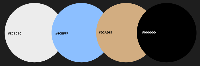
A neutral base was used to keep the interface minimal, while the product’s natural tones informed the accent palette. Blue was chosen to build trust and guide attention to key actions.
The interface colours were intentionally kept minimal to allow the product imagery to remain the primary focus
Mountain Bike website
This website is targeted at This website is targeted at mountain bike owners who enjoy maintaining and customising their bikes. The primary goal is to help users quickly find compatible parts and information with minimal friction. The layout prioritises clear navigation and product categorisation to reduce search time and cognitive load.
The colour palette uses natural, earthy tonrd such as greys, browns and greens to reflect the outdoor nature of mountain biking and creates a grounded, trustworthy feel.